
EduRe – TAFE QLD Help & Training
Create or customize dashboards
Dashboards in Microsoft Dynamics 365 provide an overview of business data ‒ actionable information that’s viewable across the organization. Use a dashboard to see performance at a glance.
You can create two types of dashboards:
• User dashboards. A user dashboard can be created by any user in the user’s work area: Sales, Service, or Marketing. A user dashboard doesn’t have to be published to be visible, but it’s only visible to the person who created it, unless shared with others. A user dashboard can be set as the default dashboard, in which case it overrides the system dashboard for that user.
• System dashboards. A system dashboard is created by a system administrator or customizer in the Settings area. A system dashboard must be published to be visible. After it’s published, it’s visible to everyone in the organization, unless hidden by the admin or customizer. The admin or customizer can set a particular dashboard as the default dashboard for the whole organization.
Manage dashboard components
You can create and design dashboards to show the information that you want exactly how you want to see it. While designing the dashboard, you can rearrange or remove the components that you have already added and change the height and width of a component.
By default, you can add only six components to any dashboard layout. This limit is configurable. For more information, contact your system administrator.
• Click on EduRe in the navigation bar.
• Do one of the following:
· In the web app: Click Dashboards.
· In Dynamics 365 for Outlook: Click My Work > Dashboards.
• Click New.
• As you’re creating your dashboard, to undo the last action, click or tap Undo. To repeat an action, click Redo.
• To rearrange the components, click the component header and drag it to an empty area on the dashboard or to the area of an existing component. When you drag a component over other components, a red line appears on top of the components to show that if you drop the component here, the existing component will move down.
• To change the width of a component, select the component, click the More Commands icon and click Increase Width or Decrease Width. The width increases or decreases by one column.
• To change the height of a component, click Increase Height or Decrease Height. The height increases or decreases by three rows.
• To remove a component, select it and click Remove. When you remove a component, any new components are added in the bottom area of the designer. You can rearrange the components at any time after you insert them.
Set properties for a chart or list included in a dashboard
To edit a chart or list component from the dashboard layout screen, double-click the chart or list. This opens the Set Properties dialog box.
You can set the following chart properties from the Set Properties dialog box:
• Name. Unique name for the chart. Dynamics 365 suggests a value, but you can change it.
• Label. The label that appears at the top of the chart.
• Display label on the Dashboard. Select or clear this check box to display or hide the chart label.
• Entity. Select the entity (record type) to base the chart on. This setting determines the available values for the Default View and Default Chart properties.
• Default View. Select the view used to retrieve the data for the chart.
• Default Chart. Select the default chart that you want to display when the dashboard is first opened. The available values are determined by the value set for the Entity property. This property works together with the Display Chart Selection property. A user can change the type of chart if the Display Chart Selection option is turned on, but the chart will revert to Default Chart the next time the dashboard is opened.
• Show Chart Only. Select this check box if you want to display just the chart. Clear this check box if you want to display the chart and its associated data.
• Display Chart Selection. Select this check box to enable users to change the type of chart (column, bar, pie, etc.) when they use the dashboard. If the user changes the type of chart, the settings aren’t saved. The chart type reverts to the Default Chart setting when the dashboard is closed.
You can set the following list properties from the Set Properties dialog box:
• Name. Unique name for the list. Dynamics 365 suggests a value, but you can change it.
• Label. The label that appears at the top of the list.
• Display label on the Dashboard. Select or clear this check box to display or hide the list label.
• Entity. Select the entity (record type) to base the list on. This setting determines the available values for the Default View property.
• Default View. Select the view used to retrieve the data in the list. A user can change the view, but the list will revert to Default View the next time the dashboard is opened.
• Display Search Box. Select this check box if you want to display a search box at the top of the list. If the search box is included, you or other users can search for records in the list at runtime.
• Display Index. Select this check box if you want to display the A to Z filters at the bottom of the list. When the A to Z filters are displayed, you or other users can click or tap a letter to jump to records that start with that letter.
• View Selector. Select from the following values:
· Off. Don’t display the view selector. You or other users won’t be able to change views at runtime.
· Show All Views. Provide a full list of views associated with the value set in the Entity property.
· Show Selected Views. Select this setting to limit the list of views available at runtime. To select the specific views to be displayed, hold down the Ctrl key and tap or click each view you want to include.
Start your day with a dashboard
Each time you sign in to the system you’ll see a dashboard, which gives you easy-to-read charts and graphs that help you see how you and your team are doing with key metrics (also known as key performance indicators, or KPIs).
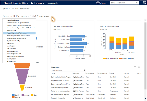
Choose from different dashboard layouts
The system comes with several dashboard layouts tailored for your role. For example, on the Sales Activity Dashboard, you’ll see the status of open opportunities in the pipeline, progress toward goals, open leads and opportunities, the Sales Leaderboard, and your activities.
To see a different dashboard layout, click the down arrow next to the name of the dashboard, and then select the layout you want.
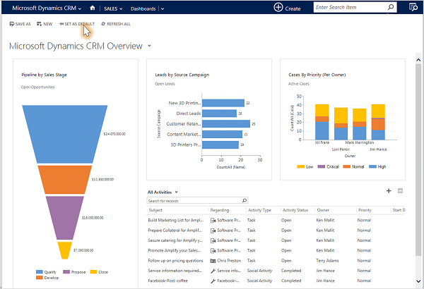
Choose a default dashboard
When your system is set up, the system administrator picks a default dashboard layout that everyone sees when they first sign in. If you want to see a different dashboard, you can override the system-wide default.
Display the dashboard you want, and then click Set as Default at the top of the screen.
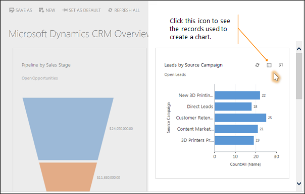
Drill in to chart data
You can view the list of the records used to calculate the metrics shown in a chart.
Point to the chart, and then click the Drill in button ![]() . (You won’t see the button until you point to the chart.)
. (You won’t see the button until you point to the chart.)
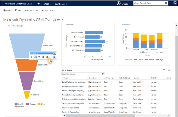
Change a chart
You can try out different types of charts, and see how your data looks when you use different fields for the calculations, right from within the dashboard layout.
On a dashboard, click the segment of the chart you want to view as a different type of chart. For example, click a segment of a pie chart or bar graph.
From the drop-down, select a different field to use for the calculations.
View relevant and trending information on a dashboard with Office Delve
Office Delve in Dynamics 365 is a new way to find and discover relevant and trending documents across your organization. Delve searches across your company and uses Azure Machine Learning to provide a view of the documents you are most interested in based on who created, viewed, edited, or shared the documents. Delve is a new dashboard component that can be added to any user or system dashboard so you can view trending information from within Dynamics 365.
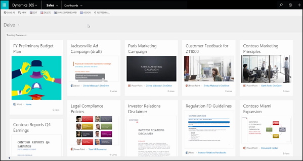
View trending information important to you.
To use Delve, the Office 365 administrator must first enable it.
Important:
This feature requires that you have an Office 365 subscription or a subscription to an online service such as SharePoint Online or Exchange Online. For more information, see What is Office 365 and how does it relate to Dynamics 365 (online)?
Add Delve to a dashboard
You can add Delve to an existing dashboard or create a new dashboard and add it.
New dashboard
To add Delve to a new dashboard, follow these steps.
1. On any dashboard page, click New.
2. Choose a layout, and then click Create.
3. Click DELVE, and then drag the DELVE component onto the dashboard and double-click it to set the properties.
4. Add other web components as desired.
5. Save the dashboard.
Existing user dashboard
1. To add Delve to an existing user-created dashboard, follow these steps.
2. Open the user dashboard.
3. Click Edit.
4. Click DELVE, and then drag the DELVE component onto the dashboard and double-click it to set the properties.
5. Save the dashboard.
Existing system dashboard
To add Delve to an existing system dashboard, follow these steps.
Note: Make sure you have the System Administrator security role or equivalent permissions in Microsoft Dynamics 365.
1. Click Settings > Customizations > Customize the System
2. Under Components, click Dashboards. Select a dashboard and then double-click it to view the dashboard components.
3. Click DELVE, and then drag the DELVE component onto the dashboard and double-click it to set the properties.
4. Save the dashboard.
Open Office Delve
From any dashboard with the Delve web component installed, you can open Office Delve in a separate browser page.
Open a dashboard with the Delve component installed.
Double-click the Open Office Delve ![]() icon.
icon.
Drill down in a chart
You can drill down into a segment on a chart to filter chart data for that segment. For example, you can drill down on one segment of a sales pipeline chart. You can also change the chart type as you drill down.
1. Open the list of records you want to chart, and then click the chart bar to the right of or above the list of records.
2. Follow the steps for the app you’re using.
a. If using the Dynamics 365 web application
i. Click the Charts area
b. If using Dynamics 365 for Outlook
i. In the ribbon, click Chart Pane, and then select where you want the chart to be displayed.
3. In the chart area, click the arrow next to the chart name, and then click the name of a chart.
4. Click the category area of the chart you want to drill down into.
5. In the shortcut menu, click Select Field, and then click the field to group by.
6. Click the button for a chart type.
7. Click OK.
Note: To go back to the previous chart, click Back.